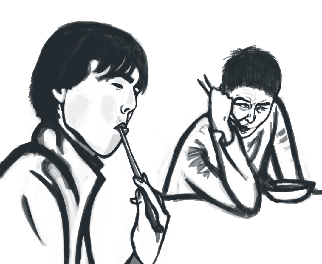
The reason I started Headshots Week is because some of my friends thought my shading style was boring. :| I like the old-school 2D shading with only a few tones and I usually use shadow work just like that. For example:
This is typical to the shading style I use. I could have worked harder on his hair, I guess. Anyway, so when my friends said I need to try my hand at soft shading, I started coloring headshots for practice and I was able to come up with some good results:


I tried varying the amount of soft shading I used with the extent of cell-shading. So in every picture here, we have two elements - one is the soft indiscernible shading done with a powdery sort of dry brush set at low opacity and the other is a smoother, defined ink that contours the shapes.
If you look closely at the purple drawing, you'll see that i used more definition and more softness. I don't like the result.
In the green one, I used very little of both and I liked how it turned out but I wasn't sure I could use it often. For example, if I colour a comic with this method, there will be scenarios where the drawing needs more definition and this light look won't do.
In the blue drawing, I used high softness and low definition. It kinda worked and I think it works best when working in dark tones.
In the orange drawing, I used high definition and less softness. I think I like it because it makes the subject very clearly outlined but also manages to make it closer to reality (less cell-shaded, i guess).
But then these are my opinions. Maybe if my friends looked at it, they'd argue a different way. In any case, I got carried away with all the soft shading and I thought 'Hey, I should try to make a painting taking a photograph as reference and see how close I can get to it.' So I found this picture on the internet.
The reasons I chose this picture were : ONE, the limited color palette; TWO, the high contrast which makes her look almost plastic; THREE, some challenging parts like the sleeves and the hair.
Maybe I should have chosen an even less complex picture. Maybe something like this would have been better for a first attempt:
Maybe next time. :) Anyway, what I'm going to say is, I failed quite terribly. But once again I learned a lot. For one, I know I don't do enough paint-work. My deviantart account hardly has any drawings, mainly because I don't have paintings to post and I think its a waste to put sketches there (unless they're like WOW). Secondly, with this exercise I was able to test my ability to start with a definite idea and be able to stick to it till the end. I'd give myself a ... 40%? x_x Bleh, nepotism. Without blabbering on for any longer, here's the painting:
You don't even need to place them together. :P Its obvious. Sorry for the long post.